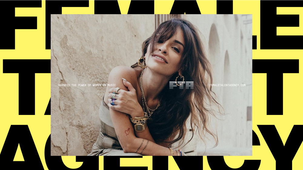
Female Talent Agency (FTA) is a movement. A business designed to empower female voices in the rapidly growing Middle Eastern music industry. They are an organisation bridging the gap between artists and brands, creating a space where female artists can thrive and collaborate authentically. Our branding work helped them announce themselves with a bang. They are not asking for a seat at the table, they’re taking it and their identity reflects this. Bold, confident and unexpected. They champion feminine power without conforming to girly norms.


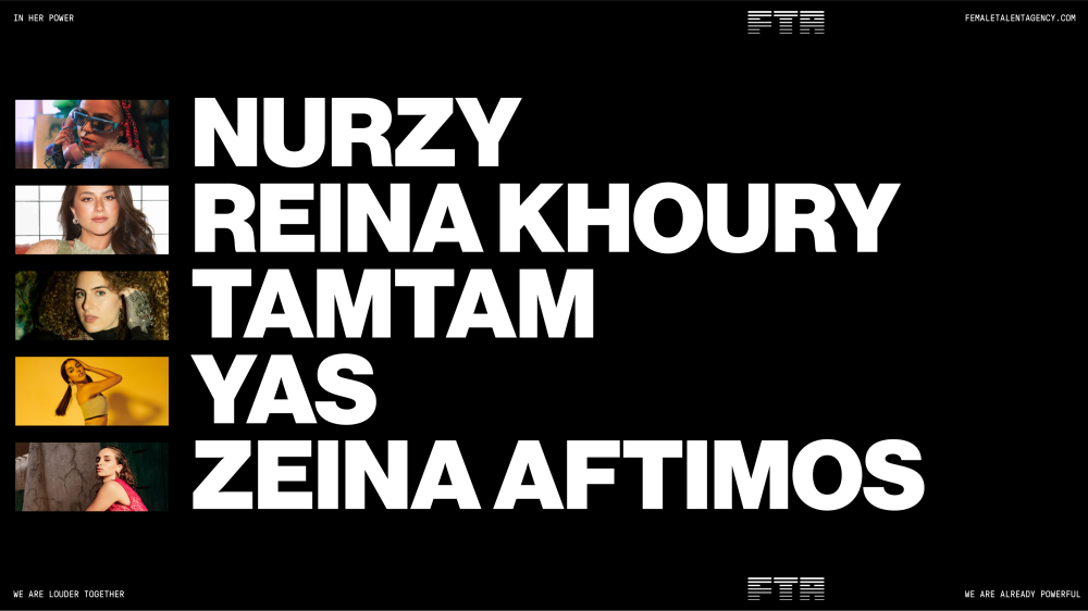



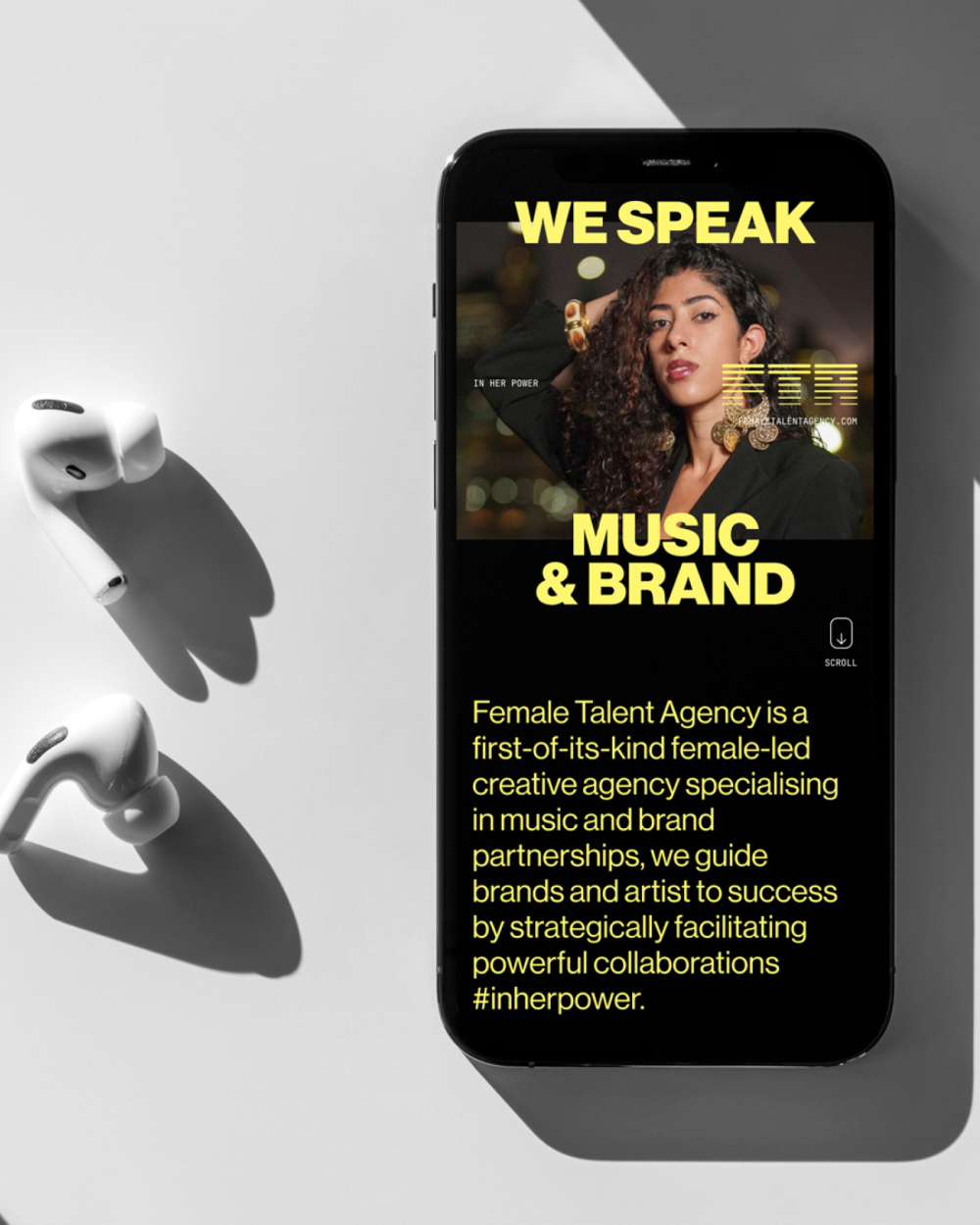

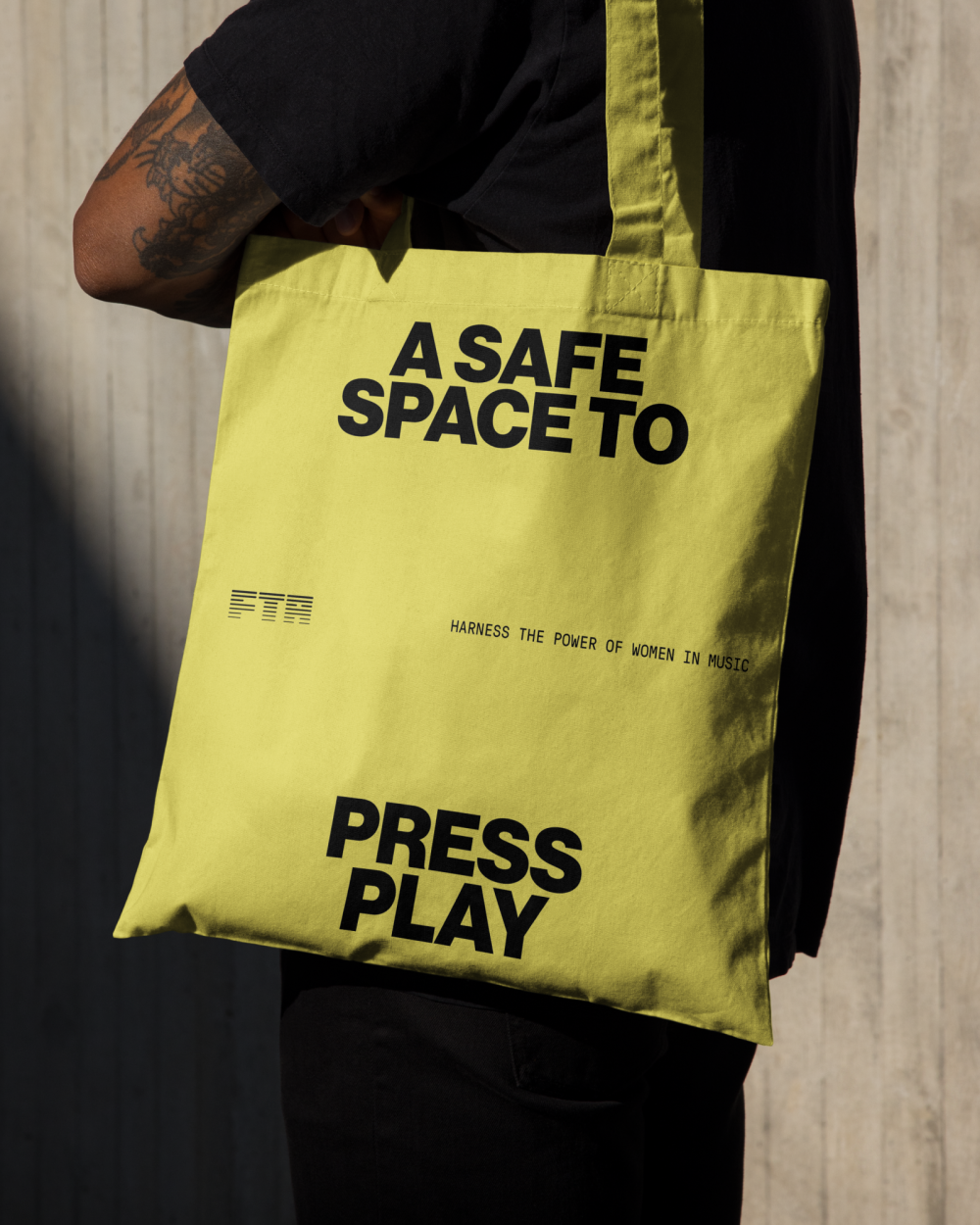


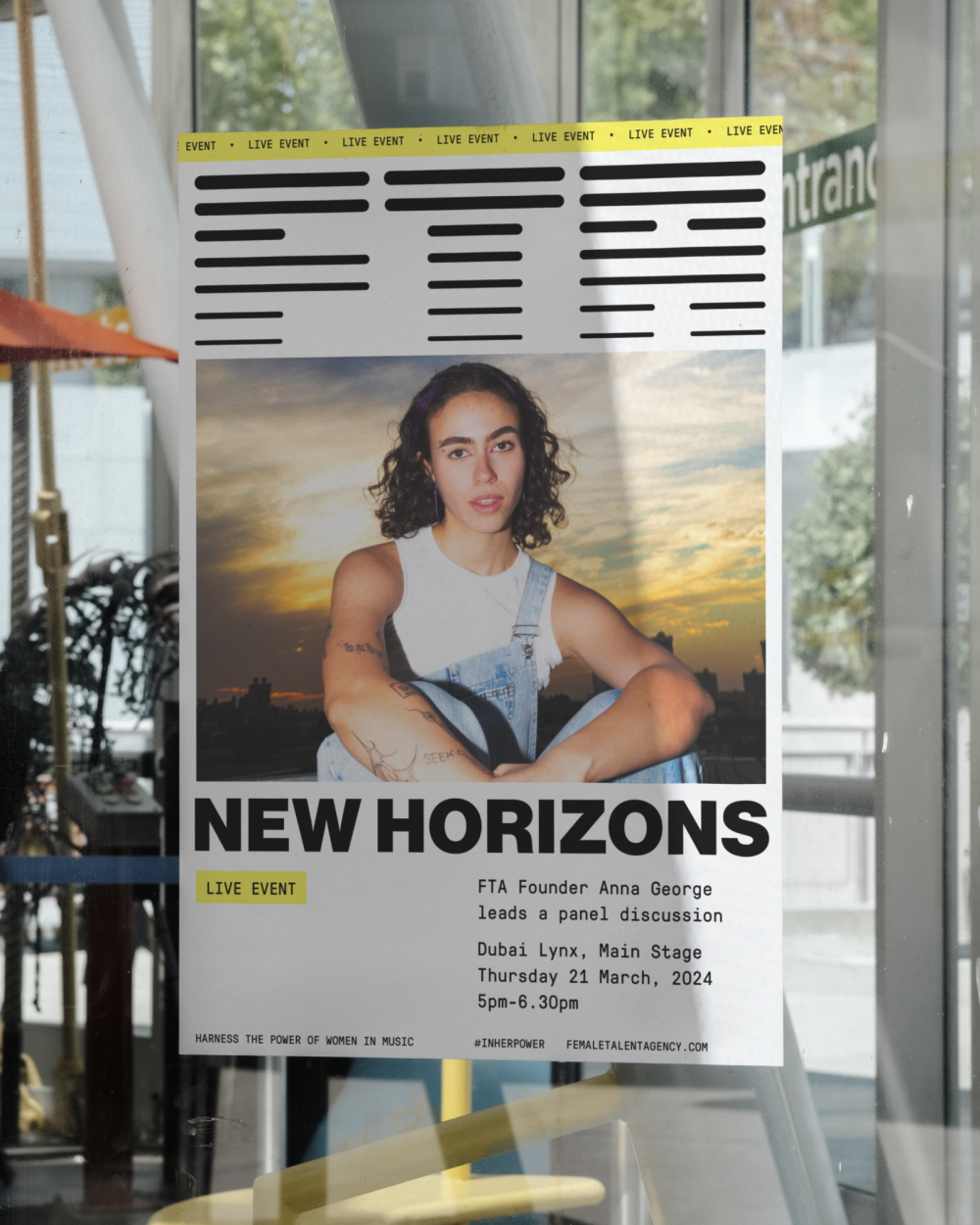
We dug deep into the region, the industry, the artists and the market as well as working through several workshop sessions to establish the right brand platform. Founder Anna George launches this venture on the back of a 15 year career in which she has spearheaded growth and change across the region for giant industry players such as Sony and TikTok. She has been breaking new ground for more than a decade. Anna has witnessed changing attitudes first hand throughout her career and FTA represents a watershed moment for female talent in the Middle East. Now is the time. FTA is the first agency of its kind in the Middle East. It’s born out of deep industry and regional knowledge, decades of experience working with brands in the region and a foresight born out of that which has identified the unique opportunity for brands to harness the power of the diverse female voices transforming MENA. We distilled this perfect storm of feminine energy into the brand position In Her Power.
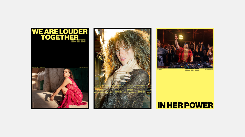
Key for FTA was celebrating feminine energy without falling into feminine stereotypes. FTA is anything but subservient and the identity needed to reflect this. Yellow is a colour heavily associated with creativity. It’s high energy, and in western cultures, generally neutral in terms of gender associations. In our research we discovered that in Islamic teachings yellow is a colour prohibited for males. All of which helped drive us towards the bold, high-contrast colour palette that underpins FTA’s visual identity. This is a purpose driven business with a lot to say. It’s confident enough to stand behind its beliefs and is designed to drive change. This attitude is reflected in the type led design system. Bold headlines in ALL CAPS dominate many of the layouts. Playful intersecting of type and image with unexpected layout choices give the branding a contemporary, almost brutalist feel. Photography will more often than not take centre stage. It is designed to amplify the identity whilst also letting the artists themselves be the heroes. It’s an identity system that presents an uncompromising vision for the future of femininity in a rapidly evolving region.
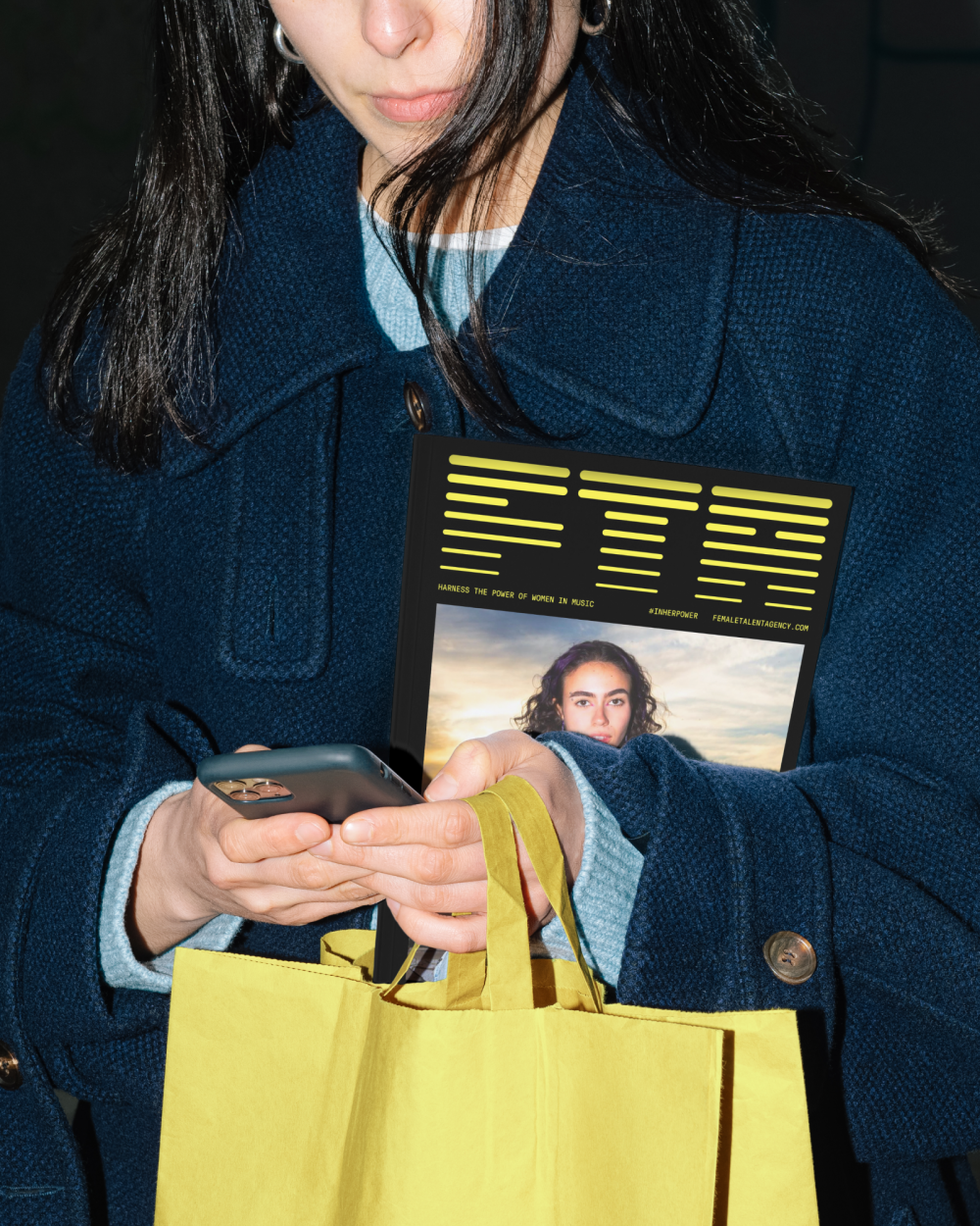
Ultimately the goal for FTA is to elevate the female voices of the region commercially. Connecting outstanding female talent with the right brands in ways that benefit all involved. Capturing the deeper purpose behind the business, whilst fully recognising the business goals that will facilitate the change FTA aims to bring, has been key to successfully launching this exciting new brand. Once we established the identity system we created social media tool kits, brand guidelines and a CMS powered website in Webflow ahead of launch. Within just a few weeks FTA had secured its first deals and was already making big waves across the region. This is one we’re really excited to watch grow.